

Overview
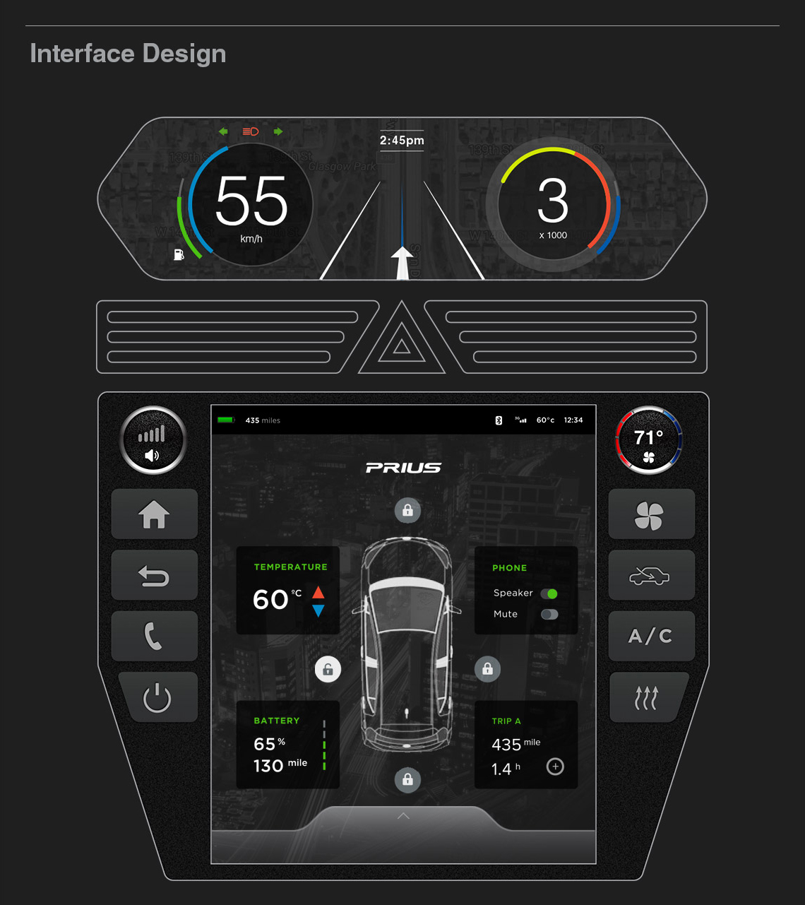
The Prius touch interface and heads-up display (HUD) are an essential part of the experience of owning and driving a Prius since this is where the MPG efficiency is displayed to the driver. Prius owners want to know how efficient their car is during the driving experience and rely on the direct feedback from the HUD for this information.
Constraints
• Prius placing the speedometer (dashboard) in the middle of the dashboard since it’s cheaper and easier for the mass production of western and eastern Prius models
• Designing for a distracted user
• Designing for different physical states: moving and at rest
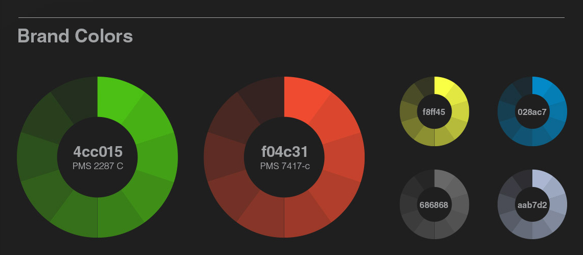
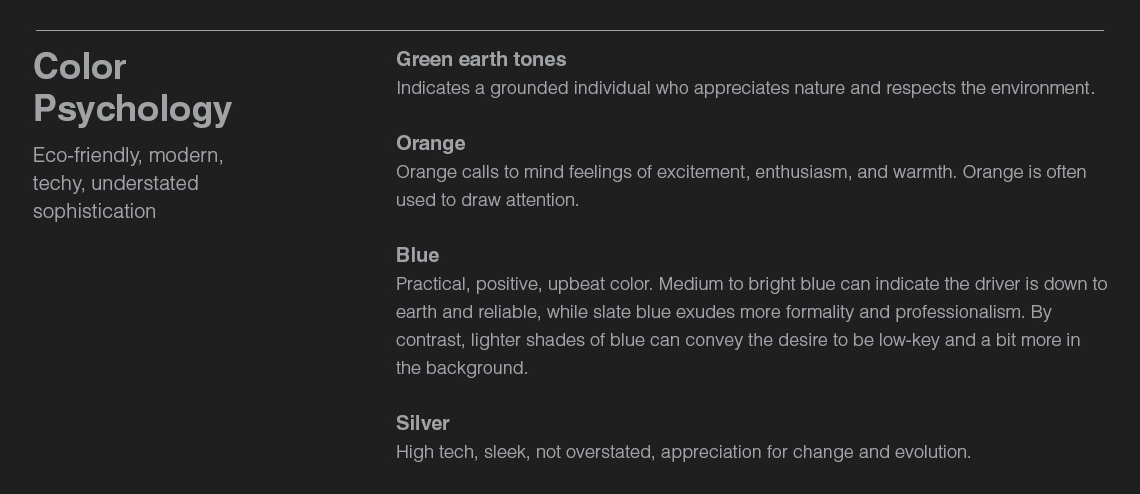
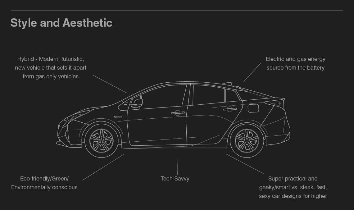
• Keeping the eco-friendly nature of the Prius at the forefront of the new design
Role & Duration
UX Research / UI Design (2017): After conducting product and user research, draw initial sketches with justifications and present it to the team. Move forward by incorporating the team feedback into initial and final wireframes. In addition, create the style guide, final mockup, and prototype based on final wireframes from the UX designers. The designers iterate based on team evaluation and feedback.
How might we create a more user-centric car dashboard and interface that is safe, intuitive, easy-to-learn, and not overly distracting?
RESEARCH TAKEAWAYS
• Simplify the dashboard by removing redundant functions and emphasize essential driving functions (Speedometer, light, driver assist, gear stick).
• Increase the size of the touch screen and the interface elements so users can see and touch more easily. This makes it safer to drive.
• Use brighter colors on the touch screen interface to increase visibility and legibility.
• Use more conventional visual cues – faster to read the menu instead of text and the same colors.
• Make it clear where the user is when navigating the menu options.
• Recategorize the menu list to match the user’s mental model.
• Make the main icons stand out on the background by increasing the size, contrast, and distinguishing colors.

Proposed New Design
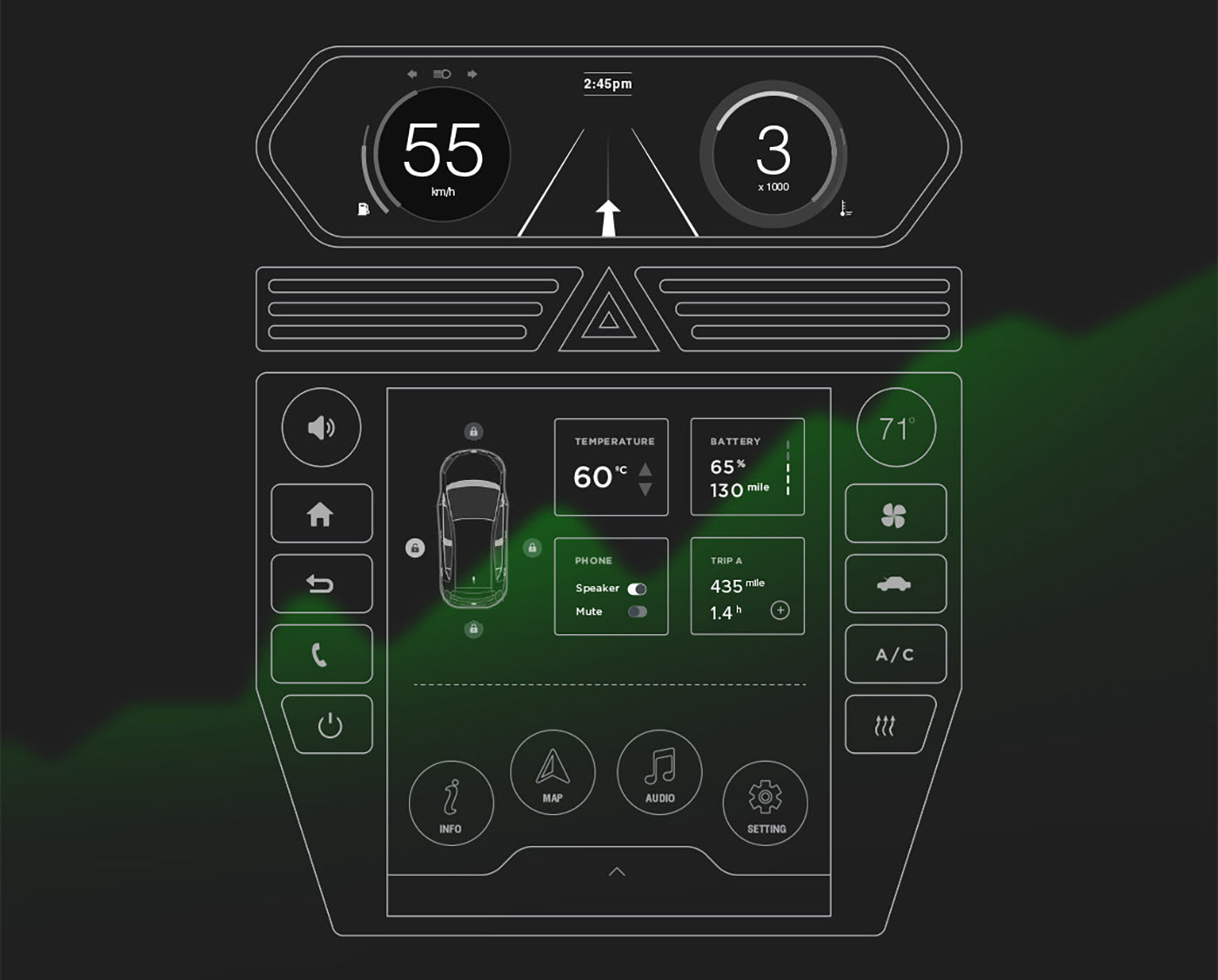


“Intuitive and naturally mapped location for physical controls.”
Final Design
• Larger, more informative displays
• Higher contrast among user interface elements
• Larger icons and controls for easy tapability
• Leverages existing car patterns that are utilized across the industry
• Nods to eco-friendliness with the use of green and visuals regarding the efficiency of the car
• Better visibility and touch/dial selection features allow the user to practice safer, less distracted driving
• Match between mobile touchscreen device and car interface displays for improved familiarity and learnability